I gave this talk at DjangoCon 2016. The slides I used are embedded below. Check out the open-source code behind this and the live preview.
My workplace recently collaborated with several police departments to build a dashboard showing 911 (also known as Call for Service) data, allowing users to drill down into that data. When I started on the project, there was a prototype written in dc.js, a JavaScript framework for building dynamic dashboards with all the data on the frontend, built around records from Tampa, FL. I needed to take this and make it capable of handling much more data – millions of records.
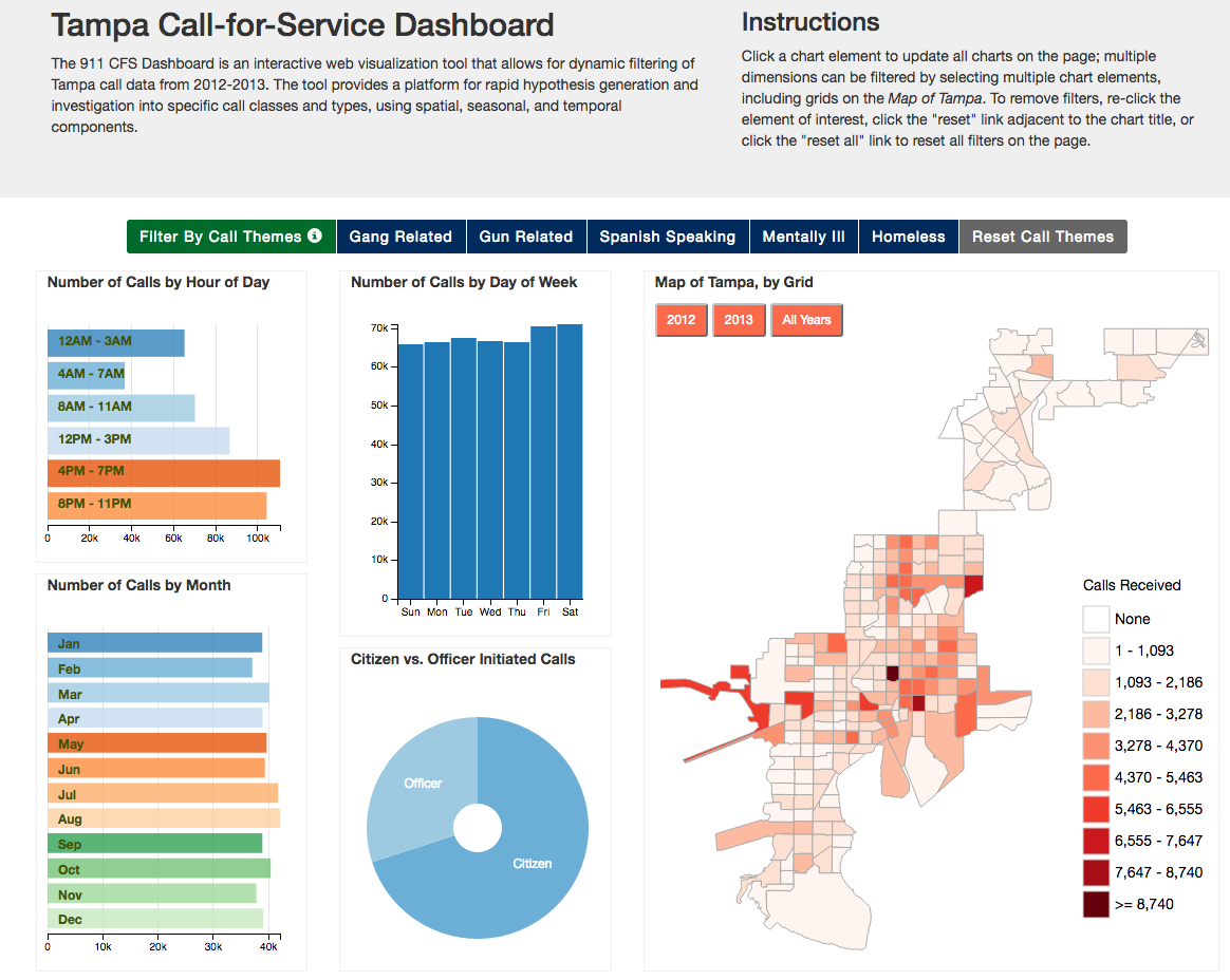
The original Tampa/dc.js dashboard.
The problem we were faced with was making this same dashboard work for other municipalities. The Tampa implementation was all done on the frontend with no back end server. The data was in a CSV file, and the entire data set was loaded into memory in the browser. This definitely wouldn’t scale for larger data sets and was hard to configure or update.
I took on the task of building this using Django and D3. Along the way, I found a set of tools that worked for me. The major components were:
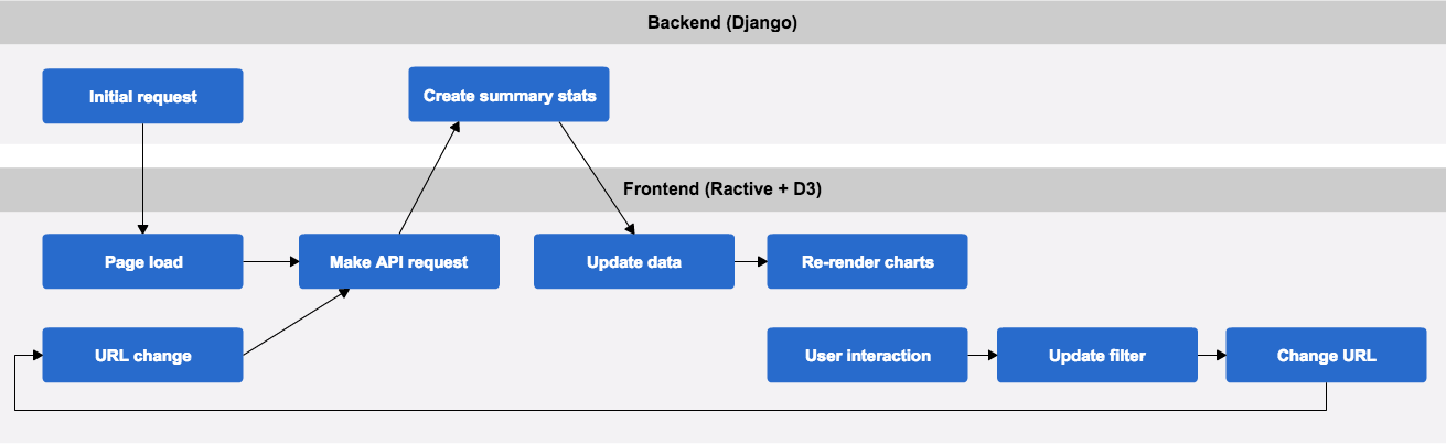
The architecture
Like in most projects, I didn’t start with the architecture I ended up with. It’s often easier for me to start with exploratory programming and figure out what I need, then start over, or massage the initial code into the discovered architecture. I had a few things I knew up front:
- All data processing should happen on the backend, ideally in the database.
- All views of the dashboard should be able to be bookmarked.
- I wanted a reactive frontend.
To explain that final point, let’s back up. What is reactive programming? The really simple answer is that the UI updates when the underlying data updates. I wanted the data to drive the application. I will talk about this more later.
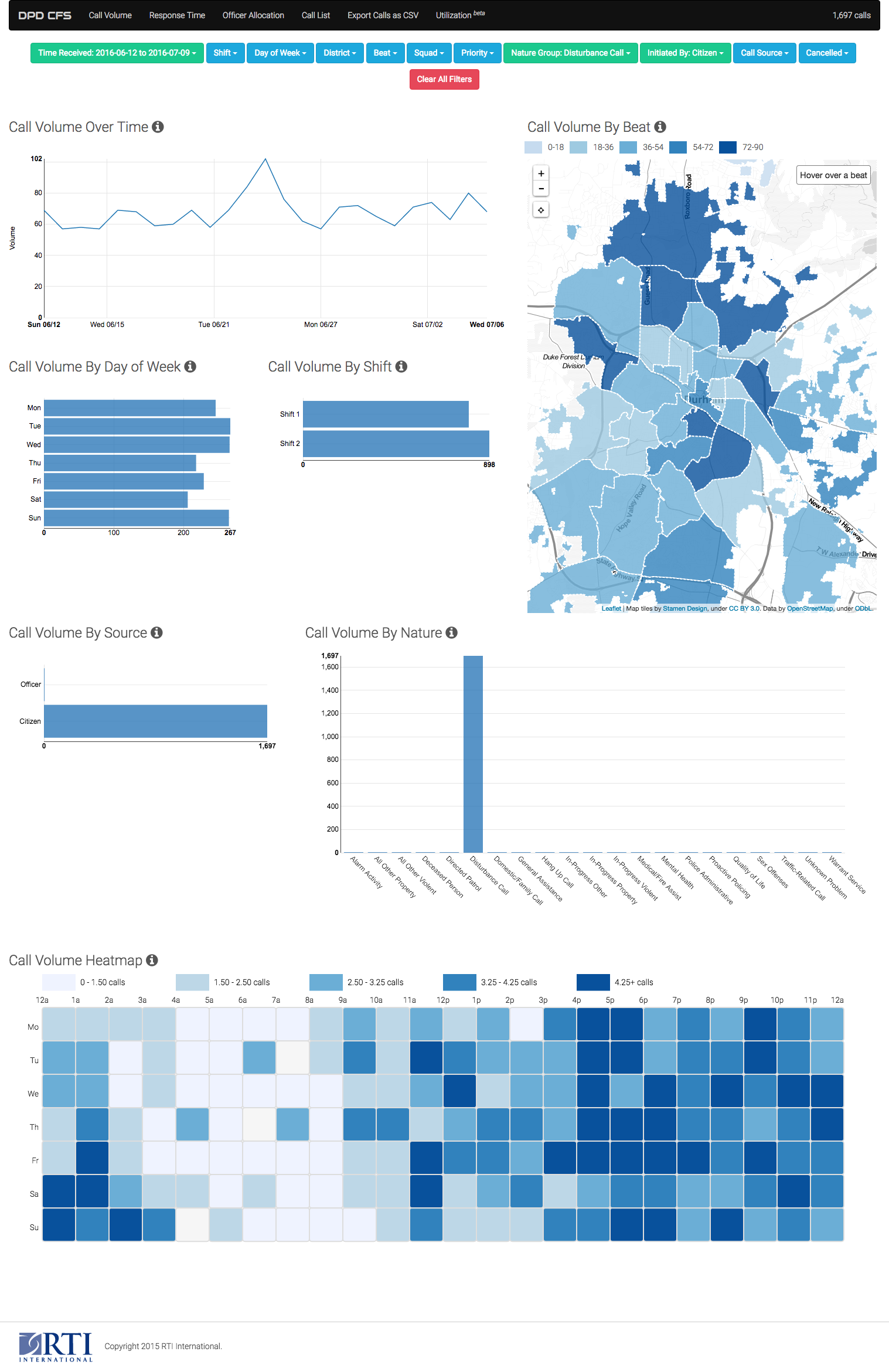
The end result.
Django
On the Django side of things, I built one JSON endpoint for each page of the dashboard. There’s a page showing the volume of 911 calls, another showing the response time, and a third showing all the calls grouped on a map, and we have an endpoint for each:
url(r'^api/call_volume/$', views.APICallVolumeView.as_view()),
url(r'^api/response_time/$', views.APICallResponseTimeView.as_view()),
url(r'^api/call_map/$', views.APICallMapView.as_view()),
To generate the content of these endpoints, I created a “summary model” for each group of charts. These summary models make database calls and generate the data structures for the API output. They all inherit from a base class so I can create new ones easily.
class CallOverview:
    def __init__(self, filters):
        self.filter = CallFilterSet(data=filters,
                                    queryset=Call.objects.all(),
                                    strict_mode=StrictMode.fail)
        self.qs = self.filter.filter()
        self.bounds = self.qs.aggregate(min_time=Min('time_received'),
                                        max_time=Max('time_received'))

    def by_dow(self):
        results = self.qs \
            .annotate(id=F('dow_received'), name=F('dow_received')) \
            .values("id", "name") \
            .annotate(**self.annotations)

        return self.merge_data(results, range(0, 7))

class CallVolumeOverview(CallOverview):
    annotations = dict(volume=Count("id"))

class CallResponseTimeOverview(CallOverview):
    annotations = dict(mean=Avg(Secs("officer_response_time")))
I use annotations in each class to determine what data I’m looking to show on that page of the dashboard.
In addition, I use custom ORM functions and aggregations in these summary models. An example:
def precision(self):
  if self.span >= timedelta(days=365):
    return 'month'
  elif self.span >= timedelta(days=7):
    return 'day'
  else:
    return 'hour'

def volume_by_date(self):
    results = self.qs.annotate(date=DateTrunc('time_received',
                               precision=self.precision())) \
        .values("date") \
        .annotate(volume=Count("date")) \
        .order_by("date")

  return results
You can see DateTrunc being used here. It uses a PostgresSQL function of the same name to give us the time received truncated by month, day, or hour depending on how much data you’re looking at.
class DateTrunc(Func):
    """
    Accepts a single timestamp field or expression and returns that timestamp
    truncated to the specified *precision*. This is useful for investigating
    time series.

    The *precision* named parameter can take:

    * microseconds
    * milliseconds
    * second
    * minute
    * hour
    * day
    * week
    * month
    * quarter
    * year
    * decade
    * century
    * millennium

    Usage example::

        checkin = Checkin.objects.
            annotate(day=DateTrunc('logged_at', 'day'),
                     hour=DateTrunc('logged_at', 'hour')).
            get(pk=1)

        assert checkin.logged_at == datetime(2015, 11, 1, 10, 45, 0)
        assert checkin.day == datetime(2015, 11, 1, 0, 0, 0)
        assert checkin.hour == datetime(2015, 11, 1, 10, 0, 0)
    """

    function = "DATE_TRUNC"
    template = "%(function)s('%(precision)s', %(expressions)s)"

    def __init__(self, expression, precision, **extra):
        super().__init__(expression, precision=precision, **extra)
That’s a lot of comments for a little bit of code. It’s nice to see how easily we can extend the Django ORM.
You can also see a custom aggregation, Percentile, at work:
class CallResponseTimeOverview(CallOverview):
    annotations = dict(mean=Avg(Secs("officer_response_time")))
    default = dict(mean=0)

    def officer_response_time(self):
        results = self.qs.filter(
            officer_response_time__gt=timedelta(0)).aggregate(
            avg=Avg(Secs('officer_response_time')),
            quartiles=Percentile(Secs('officer_response_time'),
                                 [0.25, 0.5, 0.75],
                                 output_field=ArrayField(DurationField)),
            max=Max(Secs('officer_response_time')))
Each summary model has a to_dict method that generates the output:
def to_dict(self):
    return {
        'filter': self.filter.data,
        'bounds': self.bounds,
        'precision': self.precision(),
        'count': self.count(),
        'volume_by_date': self.volume_by_date(),
        'volume_by_source': self.volume_by_source(),
        'volume_by_district': self.by_field('district'),
        'volume_by_beat': self.by_field('beat'),
        'volume_by_nature': self.by_field('nature'),
        'volume_by_nature_group': self.by_nature_group(),
        'volume_by_dow': self.by_dow(),
        'volume_by_shift': self.by_shift(),
        'heatmap': self.day_hour_heatmap(),
        'beat_ids': self.beat_ids(),
        'district_ids': self.district_ids(),
    }
These summary models are powered by a set of filters. In our case, the filters are specified as GET parameters in API calls. There are two major Django packages that help with this translation, django-filter and django-url-filter. django-url-filter is less known and quirky. I used it because I found it easier to hack, which I needed to do. Either should work well for similar projects.
The first hack I needed was to allow queryset methods to be used in filters. django-url-filter takes the GET parameters, like district=7&nature=10 and passes them as arguments to the model’s .filter method – like Call.objects.filter(district_id=7, nature_id=10). With our change, any GET parameters that map to a method on the queryset will call that method, so shift=1&district=7, where .shift is a method on the queryset, will result in Call.objects.filter(district_id=7).shift(1).
You can see a simplified version of the code that does this:
def filter(self):
    include = {self.prepare_spec(i): self.prepare_value(i) for i in
               self.includes}
    qs = self.queryset

    for k, v in include.items():
        try:
            qs = getattr(qs, k)(v)
        except AttributeError:
            qs = qs.filter(**{k: v})
The other hack I needed was to allow the filter to be built from a data structure, not from a class. In order to prevent repeating myself in code, I wanted my filter to be provided to the frontend as a JSON data structure so I could use it to build the dashboard controls. You can see the data structure below. It’s a little scattershot, like most things that have been altered over time according to needs, but is pretty self-explanatory.
[ {"name": "time_received", "type": "daterange"},
  {"name": "shift", "type": "select", "method": True,
   "lookups": ["exact"],
   "options": [[0, "Shift 1"], [1, "Shift 2"]]},
  {"name": "dow_received", "label": "Day of Week", "type": "select",
   "options": [
       [0, "Monday"], [1, "Tuesday"], [2, "Wednesday"], [3, "Thursday"],
       [4, "Friday"], [5, "Saturday"], [6, "Sunday"]
   ]},
  {"name": "district", "rel": "District"},
  {"name": "beat", "rel": "Beat"},
  {"name": "squad", "rel": "Squad", "method": True, "rel": "Squad",
   "lookups": ["exact"]},
  {"name": "priority", "rel": "Priority"},
  {"name": "nature", "rel": "Nature"},
  {"name": "nature__nature_group", "label": "Nature Group", "rel": "NatureGroup"},
  {"name": "initiated_by", "type": "select", "method": True,
   "lookups": ["exact"],
   "options": [[0, "Officer"], [1, "Citizen"]]},
  {"name": "call_source", "rel": "CallSource"},
  {"name": "cancelled", "type": "boolean"}, ]
Note: the code to turn this into Python objects is gnarly.
Finally, I used Django REST Framework to create the actual endpoints. In retrospect, these could have been done with Django alone. Django REST Framework is a great platform to build on, though, and I use its serializers in other parts of the application.
class APICallResponseTimeView(APIView):
    """Powers response time dashboard."""

    def get(self, request, format=None):
        overview = CallResponseTimeOverview(request.GET)
        return Response(overview.to_dict())
Frontend
Driving from the data
Earlier, I mentioned I wanted the data to drive the application. In practice, that means the flow of the frontend application works like this:
- The user changes filters by clicking on a chart or making a selection in the filter toolbar.
- The URL is updated to reflect the current filters.
- The application watches for changes in the URL. When the URL is changed, it sends a request to the backend for new data.
- When that request returns, we update the data.
- When the data is updated, the page is updated.
We call this architecture “reactive,” but what does that mean? The frontend subscribes to events (including data changes) and updates itself in response to those events. The last two items are the obviously reactive part of this.
The first three items are interesting, though, and invert what you might expect. On changing filters, I update an internal state and when that state is updated, the URL hash is updated. I subscribe to “hashchange” events, and fire off Ajax requests on those events. You can look back at the following steps in the application flow and see several events and reactions. While they may look synchronous in the application, note that all are asynchronous.
- When the user clicks on a chart, the filter changes.
- When the user uses the filter bar, the filter changes.
- When the filter changes:
- the URL hash is updated
- the filter bar is updated
- When the URL hash changes, an Ajax request is sent for new call data.
- When the request returns, the call data is updated.
- When the call data is updated, the charts update.
This reactive paradigm is the same one you see in React.js, which is well known. We used Ractive.js, which is not as well known, but is a simple and easy-to-understand implementation. For a dashboard like this, Ractive’s level of complexity was perfect. In both libraries, you make components. Those components have data, emit events when their data changes, and can emit events through UI interaction.
An example of a simple Ractive component and associated template:
var ChartHeader = Ractive.extend({
  template: require("../templates/chart_header.html"),
  data: {
    hidden: true
  },
  oninit: function() {
    this.on("toggleExplanation", function() {
      this.set("hidden", !this.get("hidden"));
    });
  }
});
<div>
  <h3 class="chart-title">
    {{ title }}
    <i class="fa fa-info-circle clickable"
    on-click="toggleExplanation"></i>
  </h3>
  {{ #unless hidden }}
  <div class="explanation well">
    {{ >content }}
  </div>
  {{ /unless }}
</div>
Note that this template isn’t just rendered once. Whenever the underlying data changes in the Ractive component, the template is re-evaluated.
Charts
D3 is the best and most full-featured visualization library that currently exists, but it’s not accurate to describe it as a charting library. It’s a low-level toolkit that you can use to make charts and other visualizations. If you just want some charts, choosing something higher-level makes your job a lot easier. You should probably choose something based on D3 – having D3 as the base makes it easier to create new visualizations like our heatmap. Some recommendations:
We used NVD3. It was a decent decision: NVD3 has great default styling and has a good variety of charts.
Let’s see an NVD3 chart and how we update it. We start with a higher-level object I created, HorizontalBarChart.
var volumeByDOWChart = new HorizontalBarChart({
    dashboard: dashboard,
    filter: "dow_received",
    el: "#volume-by-dow",
    ratio: 1.5,
    fmt: d3.format(",d"),
    x: function (d) {
        return d.name;
    },
    y: function (d) {
        return d.volume;
    }
});

monitorChart(dashboard, "data.volume_by_dow", volumeByDOWChart.update);
The HorizontalBarChart takes an assortment of options, some presentational and some more fundamental. dashboard is the actual Ractive dashboard widget, which we need to access some of its data and to set up an event to make the chart on completion of the dashboard loading. filter is the key in the filter object that this chart will update on click. The rest are presentation options to tell the chart where to render and how to format its data.
Like all my higher-level components, HorizontalBarChart has a .create method, called on instantiation, and an .update method called by monitorChart. monitorChart is a function that sets up a watcher on the dashboard’s data for a specific “keypath” (that is, if the data is a tree, a series of steps on that tree) to call a function when that subset of the data is changed.
function monitorChart (ractive, keypath, fn) {
  ractive.observe(keypath, function (newData) {
    if (!ractive.get("loading")) {
      fn(newData);
    }
  });
}
Making a new chart is as simple as defining a new chart object and setting up monitorChart on it. (In retrospect, monitorChart is a terrible name for this: it really should be called monitorRactive.)
Heatmap
Not everything can be done with a high-level library, however. For this dashboard, we wanted a day/hour heatmap to see 911 call traffic volume. We had to drop to D3 for this. We used an example from bl.ocks.org to start with.
Walking through each line of this would be best left to a D3 tutorial, but two of our contributions show how we use the same pattern as with the rest of our visualizations:
this.create = function () {
    var bounds = this.getBounds(),
        container = d3.select(this.el),
        width = bounds.width,
        height = bounds.height,
        gridSize = Math.floor(width / this.ratio / 10);

    container
        .append("svg")
        .attr("width", width)
        .attr("height", height)
        .attr("viewBox", "0 0 " + width + " " + height)
        .append("g")
        .attr("transform", "translate(" + margin.left + "," + margin.top + ")");

    this.drawLabels();

    d3.select(window).on("resize", function () {
        self.resize();
    });

    this.drawn = true;
};

this.update = function (data) {
    self.ensureDrawn().then(function () {
        self._update(data);
    });
};
We have one method to set up the visualization, and then an .update method called whenever the correct subset of data in our Ractive component changes. We have to ensure the component is fully drawn, as the data in our Ractive component changes immediately on page load.
Lessons learned
Like in any software project, there’s a lot of things I would do different looking back. In writing this post, I saw lots of pieces of code I would rewrite. There’s definitely some different library choices I’d like to try. Overall, though, I’m really pleased with this piece of software, and particularly in its architecture.
The upsides of this architecture are unidirectional flow and bookmarkable state. The data processing is all done by PostgreSQL, and Django coordinates communication between the dashboard the the database.